shadcn UI의 checkbox는 왜 indeterminate이라는 상태가 존재하는가?
예전에 shadcn으로 checkbox UI를 만들어보다가 shadcn 코드베이스에 indeterminate 라는 상태가 있는 것을 보게 되었다.
체크 상태는 체크/체크 해제 밖에 없는 것 아닌가? 라고 생각해서 한 번 indeterminate의 정체가 뭔지 살펴보기로 했다.
체크박스에는 체크와 해제 외에 세 번째 상태가 있다. 이 상태의 이름은 indeterminate이고 체크도 해제도 아닌 중간 상태를 가리킨다. 이 상태는 하위 항목 중 일부만 선택된 전체 선택 체크박스에 가장 흔하게 쓰인다.
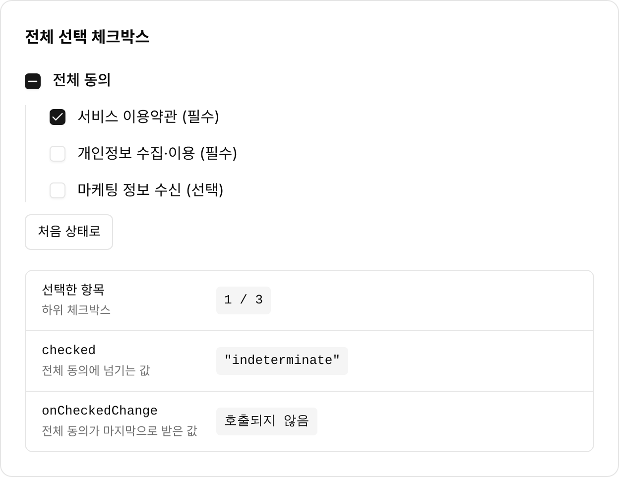
HTML은 indeterminate 프로퍼티로, WAI-ARIA는 aria-checked="mixed"로 이 중간 상태를 정의한다. Radix Checkbox는 이 중간 상태를 checked의 세 번째 값으로 지원한다. shadcn의 Checkbox는 Radix의 props를 그대로 넘긴다.
indeterminate의 의미
not definitely or precisely determined or fixed
즉, 정확히 정해져 있지 않았다는 뜻이다.
표현은 사전마다 다르지만 모두 정확히 정해지지 않았거나 분명히 알 수 없다는 뜻이다. 이 풀이에는 '중간'이라는 뜻이 없다. 이 글에서 '중간 상태'는 체크도 해제도 아닌 상태를 부르는 말로 쓴다.
shadcn의 Checkbox 파일에는 indeterminate 상태를 직접 다루지는 않는다
shadcn의 Checkbox는 Radix의 CheckboxPrimitive.Root에 스타일을 입힌 컴포넌트다.
function Checkbox({
  className,
  ...props
}: React.ComponentProps<typeof CheckboxPrimitive.Root>) {
  return (
    <CheckboxPrimitive.Root
      data-slot="checkbox"
      className={cn(
        "peer size-4 ... data-[state=checked]:bg-primary ...",
        className
      )}
      {...props}
    >
      <CheckboxPrimitive.Indicator
        data-slot="checkbox-indicator"
        className="grid place-content-center text-current transition-none"
      >
        <CheckIcon className="size-3.5" />
      </CheckboxPrimitive.Indicator>
    </CheckboxPrimitive.Root>
  )
}
이 코드에는 indeterminate 문자열이 한 번도 나오지 않는다. props의 타입은 React.ComponentProps<typeof CheckboxPrimitive.Root>로 선언한다. 그래서 checked, defaultChecked, onCheckedChange의 타입은 Radix의 정의를 그대로 따른다. 상태별 스타일은 data-[state=checked]: 접두사가 붙은 클래스에만 있다.
Radix의 checked는 세 가지 값을 받는다
그럼 indeterminate 는 어디에 있을까? shadcn 소스코드가 아니라 Radix 쪽을 살펴봐야 했다.
Radix는 checked, defaultChecked, onCheckedChange에 CheckedState 타입을 쓴다. 이 타입에는 'indeterminate' 문자열이 포함된다.
type CheckedState = boolean | 'indeterminate';

interface CheckboxProps extends Omit<PrimitiveButtonProps, 'checked' | 'defaultChecked'> {
  checked?: CheckedState;
  defaultChecked?: CheckedState;
  // ...
  onCheckedChange?(checked: CheckedState): void;
}
Radix 문서는 Features 목록에서 indeterminate 상태에 대한 접근성 항목에서 따르는 패턴을 밝힌다.
Supports indeterminate state.
Adheres to the tri-state Checkbox WAI-ARIA design pattern.
Radix Checkbox에서 사용자가 누르는 요소는 <button role="checkbox">이다. button 요소에는 indeterminate 프로퍼티가 없다.
Radix는 세 번째 상태를 aria-checked와 data-state 속성으로 표시한다. 클릭 처리에서도 indeterminate 상태를 따로 구분한다.
<Primitive.button
  type="button"
  role="checkbox"
  aria-checked={isIndeterminate(checked) ? 'mixed' : checked}
  data-state={getState(checked)}
  // ...
  onClick={composeEventHandlers(onClick, (event) => {
    // ...
    setChecked((prevChecked) => (isIndeterminate(prevChecked) ? true : !prevChecked));
    // ...
  })}
/>

function getState(checked: CheckedState) {
  return isIndeterminate(checked) ? 'indeterminate' : checked ? 'checked' : 'unchecked';
}
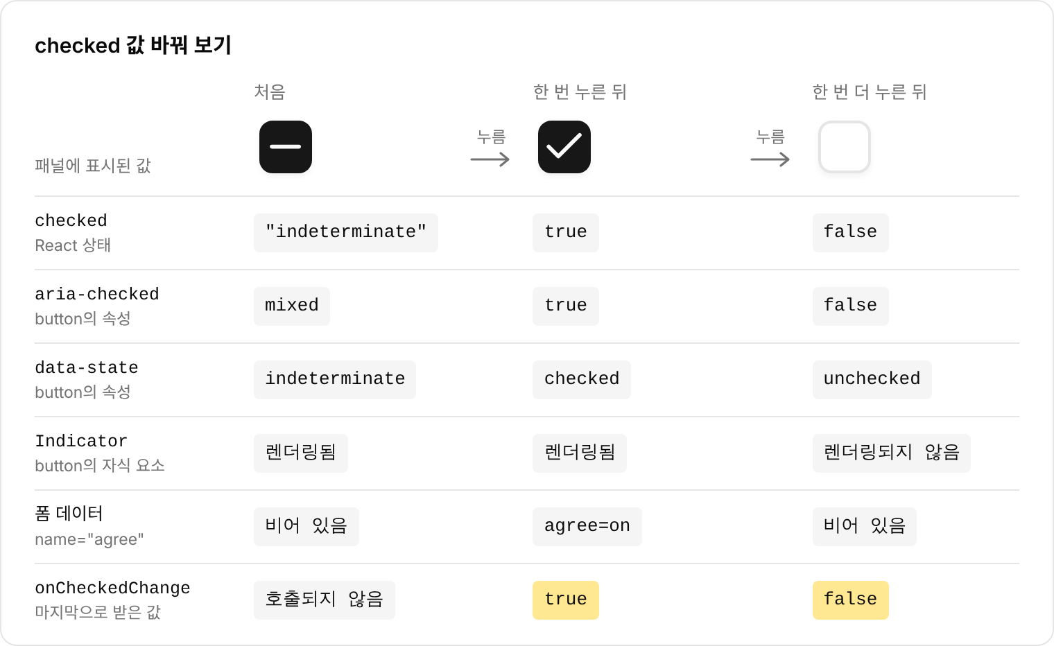
checked 값이 'indeterminate'일 때 aria-checked에는 mixed 값이, data-state에는 indeterminate 값이 들어간다. 클릭하면 indeterminate 값은 true로 바뀌고 나머지 값은 !prevChecked가 된다.
const calls: CheckedState[] = []

function Test() {
  const [checked, setChecked] = useState<CheckedState>('indeterminate')

  return (
    <form>
      <Checkbox.Root
        name="agree"
        checked={checked}
        onCheckedChange={(value) => {
          calls.push(value)
          setChecked(value)
        }}
      >
        <Checkbox.Indicator data-testid="indicator">I</Checkbox.Indicator>
      </Checkbox.Root>
    </form>
  )
}
| 시점 | aria-checked |
data-state |
Indicator |
폼 데이터 |
|---|---|---|---|---|
초기값 'indeterminate' |
mixed |
indeterminate |
렌더링됨 | 비어 있음 |
| 첫 번째 클릭 | true |
checked |
렌더링됨 | agree=on |
| 두 번째 클릭 | false |
unchecked |
렌더링되지 않음 | 비어 있음 |
HTML과 WAI-ARIA에도 같은 상태가 있다
HTML에서는 input type="checkbox" 요소의 indeterminate 프로퍼티가 중간 상태를 담당한다. MDN은 이 프로퍼티를 이렇게 설명한다.
A checkbox can be in an indeterminate state. This is set using the HTMLInputElement object's indeterminate property via JavaScript (it cannot be set using an HTML attribute)
indeterminate 프로퍼티는 checked와 별개의 값이다. WHATWG HTML 표준은 이 내용을 한 문장으로 밝힌다.
An input element's indeterminateness is independent of its checkedness.
Radix에서는 indeterminate 상태가 checked 값 중 하나이므로 checked이면서 indeterminate인 상태는 존재하지 않는다.
WAI-ARIA에서는 aria-checked가 세 번째 값 mixed를 받을 수 있다. W3C의 ARIA Authoring Practices Guide(APG)는 체크박스 패턴에서 이 세 번째 상태를 설명한다.
…tri-state checkboxes, which allow an additional third state known as partially checked.
When partially checked, it has state aria-checked set to mixed.
CheckedState의 true, false, 'indeterminate' 값은 각각 aria-checked의 true, false, mixed 값에 대응한다.
mixed 상태란?
그렇다면 mixed 상태란 무엇일까?
MDN에서는 aria-checked의 mixed를 indeterminate와 같은 값으로 설명한다. HTML 접근성 API 매핑(HTML-AAM) 초안도 input type="checkbox"의 indeterminate가 true이면 aria-checked="mixed"로 매핑하도록 정한다.
CheckedState의 true, false, 'indeterminate' 값은 각각 aria-checked의 true, false, mixed 값에 대응한다.
이 대응에 따르면 HTML의 indeterminate, WAI-ARIA의 mixed, Radix의 'indeterminate'는 같은 중간 상태를 가리킨다. HTML에서는 이 상태가 checked와 별개의 프로퍼티이고, WAI-ARIA의 aria-checked와 Radix의 checked에서는 세 번째 값이다.
indeterminate 상태의 설계 의도
HTML 표준은 체크박스를 두 상태 컨트롤로 정의한다.
The input element represents a two-state control that represents the element's checkedness state.
indeterminate는 이 컨트롤의 체크 여부와 별개의 값이고, 표준 문서는 이 값이 true이면 컨트롤의 선택 표시를 가려야 한다고 적는다.
MDN의 indeterminate 프로퍼티 문서는 이 값이 바꾸는 것이 모양이고 폼에 담기는지는 checked가 정한다고 설명한다.
이 상태의 용도는 W3C의 APG가 설명한다. APG가 드는 예는 소프트웨어 설치 프로그램이다.
One common use of a tri-state checkbox can be found in software installers where a single tri-state checkbox is used to represent and control the state of an entire group of install options.
APG에 따르면 그룹의 옵션이 모두 체크되면 이 체크박스는 체크로, 일부만 체크되면 partially checked로, 하나도 체크되지 않으면 체크 해제로 표시된다. 사용자는 이 체크박스 하나로 그룹의 모든 옵션을 한 번에 바꿀 수 있다.
WAI-ARIA 명세는 같은 용도를 aria-checked의 mixed 값으로 정의한다.
The aria-checked attribute of a checkbox indicates whether the input is checked (true), unchecked (false), or represents a group of elements that have a mixture of checked and unchecked values (mixed).
명세는 mixed 값을 쓰지 않는 체크박스가 많고 그런 체크박스는 사실상 불리언 체크박스라고도 적는다.
Win32 API 문서에는 같은 상태가 조금 다르게 적혀 있다. 3상태 체크박스를 만드는 BS_3STATE 스타일은 회색 상태의 용도를 이렇게 설명한다.
Use the grayed state to show that the state of the check box is not determined.
'not determined'는 앞에서 본 사전 풀이와 같은 표현이다. BM_SETCHECK 메시지의 BST_INDETERMINATE 값도 이 회색 상태를 indeterminate state라고 부른다.
Microsoft의 Windows 7용 체크박스 UX 지침은 mixed 상태를 사용자가 직접 설정하게 해서는 안 되고 하위 항목의 상태가 그대로 반영된 결과여야 한다고 적는다. 개별 항목에 세 번째 값이 필요하면 이 상태 대신 라디오 버튼이나 드롭다운 목록을 쓰라고도 한다.
Radix 문서는 앞에서 본 것처럼 이 컴포넌트가 tri-state Checkbox WAI-ARIA 디자인 패턴을 따른다고 밝힌다. 클릭 처리에서는 indeterminate 값이 true로, 나머지 값이 !prevChecked로 바뀌므로 클릭으로 'indeterminate'가 만들어지는 경로는 없다. 이 값은 앱 코드가 checked나 defaultChecked에 넘길 때 생기고, 하위 항목의 선택 상태를 보고 값을 정하는 일도 앱 코드가 한다. 이 점은 사용자가 mixed 상태를 직접 설정하게 하지 말라는 Microsoft 지침과 같은 방향이다. 다만 Microsoft 지침이 권하는 클릭 순환(전체 선택, 전체 해제, 원래의 일부 선택 상태로 복원)과 APG가 소개하는 일부 선택 상태의 복원은 Radix의 기본 클릭 처리에 없다.
indeterminate 상태는 전체 선택 체크박스에 쓰인다
MDN은 indeterminate 프로퍼티를 쓸 일이 많지 않다고 설명하고 가장 흔한 경우로 하위 항목을 가진 체크박스를 든다.
There are not many use cases for this property. The most common is when a checkbox is available that "owns" a number of sub-options (which are also checkboxes). If all of the sub-options are checked, the owning checkbox is also checked, and if they're all unchecked, the owning checkbox is unchecked. If any one or more of the sub-options have a different state than the others, the owning checkbox is in the indeterminate state.
shadcn의 Data Table 예제는 헤더의 전체 선택 체크박스에 이 규칙을 적용한다.
<Checkbox
  checked={
    table.getIsAllPageRowsSelected() ||
    (table.getIsSomePageRowsSelected() && "indeterminate")
  }
  onCheckedChange={(value) => table.toggleAllPageRowsSelected(!!value)}
  aria-label="Select all"
/>
checked에는 모든 행이 선택되면 true, 일부만 선택되면 "indeterminate", 선택된 행이 없으면 false가 들어간다. onCheckedChange의 value는 CheckedState 타입이다. TanStack Table 문서는 toggleAllPageRowsSelected의 시그니처를 (value: boolean) => void로 적는다. !!value는 CheckedState를 boolean으로 바꿔서 이 시그니처에 맞춘다.
같은 문서의 Base UI 버전에는 indeterminate prop이 따로 있다.
<Checkbox
  checked={table.getIsAllPageRowsSelected()}
  indeterminate={
    table.getIsSomePageRowsSelected() && !table.getIsAllPageRowsSelected()
  }
  onCheckedChange={(value) => table.toggleAllPageRowsSelected(!!value)}
  aria-label="Select all"
/>
Radix 기반 예제는 checked 값 하나에 세 가지 상태를 담는다. Base UI 기반 예제는 checked와 indeterminate 두 prop에 나눠 담는다. Base UI 문서는 indeterminate prop을 이렇게 설명한다.
Whether the checkbox is in a mixed state: neither ticked, nor unticked.
이 prop의 타입은 boolean | undefined이고 기본값은 false다.
shadcn의 기본 스타일에서는 indeterminate 상태가 체크 아이콘으로 보인다
MDN에 따르면 대부분의 브라우저는 네이티브 체크박스의 indeterminate 상태를 가로선으로 그린다.
When indeterminate is true, the checkbox has a horizontal line in the box (it looks somewhat like a hyphen or minus sign) instead of a check/tick in most browsers.
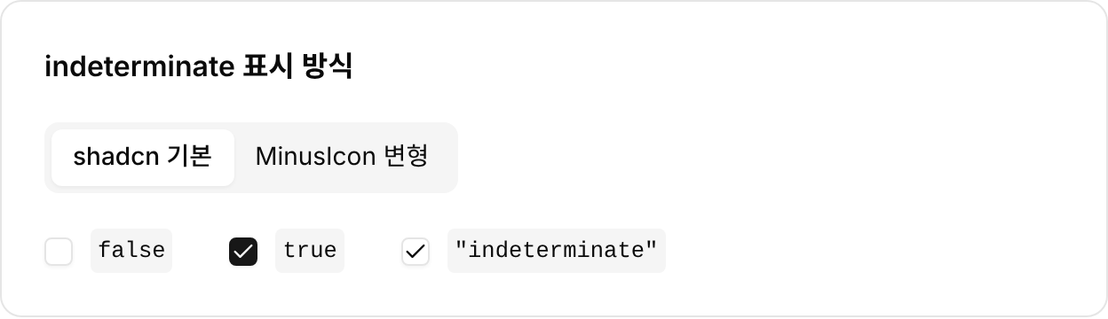
shadcn의 기본 Checkbox에 checked="indeterminate"를 넘겨 Chromium에서 렌더링하면 가로선 대신 체크 아이콘이 나온다. 배경은 채워지지 않고 테두리 색도 unchecked와 같다. 아이콘만 checked와 같은 체크 모양이다.
이렇게 보이는 이유는 앞에서 본 shadcn 코드에 있다. 상태별 스타일은 data-[state=checked]에만 있다. Indicator는 indeterminate 상태에서도 렌더링되며 자식은 CheckIcon 하나뿐이다. Radix 문서는 Indicator를 이렇게 설명한다.
Renders when the checkbox is in a checked or indeterminate state.
indeterminate 상태에 별도의 모양을 주려면 스타일과 아이콘을 직접 추가해야 한다. 아래는 data-state로 분기해서 채워진 배경과 MinusIcon을 주는 변형이다.
<CheckboxPrimitive.Root
  data-slot="checkbox"
  className={cn(
    "group ... data-[state=indeterminate]:border-primary data-[state=indeterminate]:bg-primary data-[state=indeterminate]:text-primary-foreground ... dark:data-[state=indeterminate]:bg-primary",
    className
  )}
  {...props}
>
  <CheckboxPrimitive.Indicator ...>
    <CheckIcon className="size-3.5 group-data-[state=indeterminate]:hidden" />
    <MinusIcon className="hidden size-3.5 group-data-[state=indeterminate]:block" />
  </CheckboxPrimitive.Indicator>
</CheckboxPrimitive.Root>
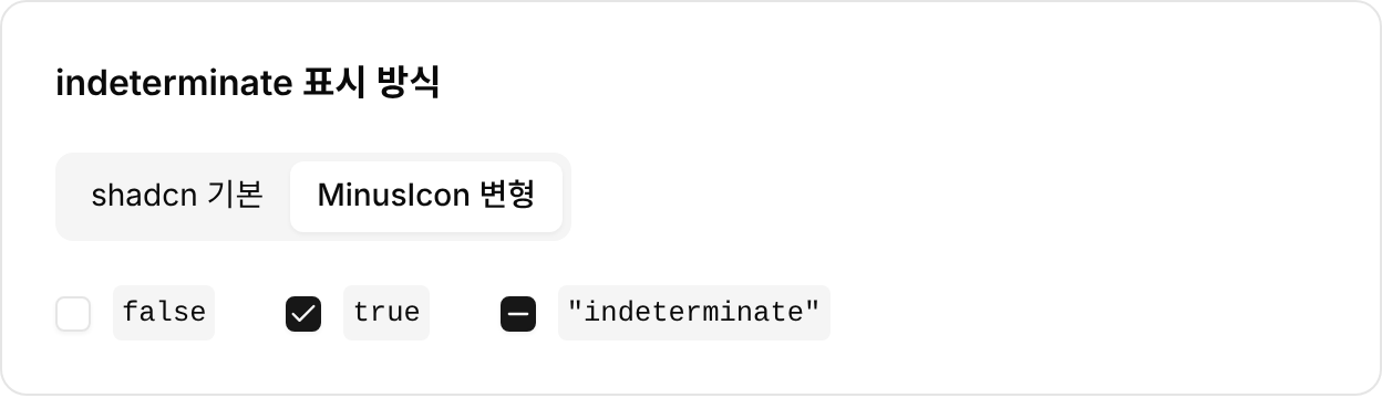
checked가 "indeterminate"이면 체크도 해제도 아닌 상태이고 체크박스를 누르면 onCheckedChange가 true를 받는다. checked가 true이면 체크 상태이고 누르면 false를 받는다. checked가 false이면 해제 상태이고 누르면 true를 받는다. 누르는 동작으로는 "indeterminate"가 만들어지지 않으므로 체크박스를 누를 때 onCheckedChange가 받는 값은 true나 false뿐이다. 버튼으로 checked를 바꾸면 checked만 바뀌고 onCheckedChange는 호출되지 않는다.
앞에서 본 "전체 선택 체크박스" 패널에서는 하위 항목 일부만 선택하자 "전체 동의" 체크박스의 checked가 "indeterminate"로 바뀌었다. 이 상태에서 "전체 동의" 체크박스를 누르자 onCheckedChange가 true를 받았고 모든 항목이 선택됐다. 하위 항목을 모두 직접 선택했을 때는 "전체 동의" 체크박스를 누르지 않아도 checked가 true였다.
폼 데이터는 두 가지이지만 체크박스는 세 가지 상태를 가질 수 있다
HTML 표준에서 체크박스는 체크와 해제 두 상태를 갖는 컨트롤이다. MDN에 따르면 indeterminate는 모양만 바꾸고 폼에 담기는지는 checked가 정한다. Radix에서도 'indeterminate' 상태의 폼 데이터는 unchecked와 같이 비어 있다. 반면 체크박스의 모양과 접근성 속성에는 세 번째 상태가 있다. WAI-ARIA의 aria-checked와 Radix의 checked는 true, false 외에 이 상태를 값으로 받는다. 이 상태는 일부 하위 항목만 선택된 전체 선택 체크박스를 나타내는 데 쓰인다. shadcn의 Checkbox는 checked의 타입이 Radix의 정의를 그대로 따르므로 'indeterminate'도 checked의 값으로 받는다.


